Friday, 8 April 2011

Thursday, 7 April 2011
Evaluation part 4

- My album cover and advertisment both use mysterious artwork and my music videos opening shot is of a church and grave yard which add mystery to my music video as it does not give to much away about the rest of the video.
2. My music video is black and white during moments of sadness. This fits in well with my album cover and advertisment as both use a colour sceme consisting of mainly dark colours which reflect the nature of the music video and reflect the song title "The Funeral of hearts" as being a song about sadness.
3. On my album cover and advertisment it shows the image of a broken Ankh. The Ankh symbolises life so a broken Ankh will be a symbol of death. This fits in well with my music video as there is a shot of a rose against a tombstone which along with representing the song title symbolises death like the broken Ankh
Evaluation part 3 continued

Question 5 shows that most people thought that the questions asked in the interview were typical of an interview with a band member of this musical genre. This shows that I met with the characteristics of the rock/metal genre and therefore it made my media text more realistic.
Evaluation part 3
What did you learn from your audience feedback?
- Source of audience feedback= Opinion Poll

Question 1 shows that the majority of the people asked thought that it was obvious that my album promotion package was of the rock/metal, which shows that I had used the appropriate codes and conventions of the rock/metal visual appearence.
- Question 2 shows that the highest number of people thoght that my album cover best fitted with the codes and conventions due to the mysterious artwork. This shows that i met with this particular code and convention but it also shows that I should of to include more dark colours to meet with the other main code and convention.
- Question 3 shows that the best way my album advert attracts potential buyers is by including the Metal Hammer magazine name and website. This shows that by associating my album with Metal Hammer magazine it gives people a clearer idea of the type of rock/metal music and would also attract buyers who read the magazine which would make sure that the album goes to the right target audience.
- Question 4 shows that my music video fiited with the song title the most by having the character place a rose (symbolising love) on to a tombstone. This is an encouraging result as I felt that with the song title being "The Funeral of Hearts" this reflected the song title in the best way. However it would of been better if id given the actor more time to develop character and if id given more thought into which parts should be in black and white.
Evaluation part 2
- Sony camera used to shoot music video
- Ditgial camera used to take photos of potential locations
- Adobe Premier Pro used to edit music video
- Adobe Illustrator used to construct album cover
- Microsoft Publisher used to construct album advertisment
- Blogger used to keep a log of my work
Research
- Google used to research codes and conventions of music videos
- Youtube used to find examples of the different types of music videos
- Blogger used to keep a log of my research
Evaluation
- Youtube used to get screen shots of my music video
- Google used to obtain images for my mood boards
- Microsoft Publisher used to construct my mood boards
- Blogger used to construct a record of my evaluation
The planning stages did not require the use of technologies, with the exception of Blogger which was used to keep a log of my planning.

Evaluation part 1.5
Music Video (use)
-Uses a fading effect

Fading effect before
Fade effect during


Fade effect after
- -Uses Jump cutting
Music video (challenge)
- My music video is a 100% narrative music video (This is very rare in rock/metal music videos!)
Wednesday, 6 April 2011
Evaluation part 1

Album advert (use) By incorporating the album cover into the album advert making it the main image. Including tour dates and a special offer in order to persuade people to buy the album. Including the record company logo.Using dark colours in order to follow the connotation of Rock/Metal music as being dark and mysterious.
Album advert (challenge) Does not include a release date.Does not include the bands official website.
Album Cover (use) Uses dark colours in order to follow the connotation of Rock/Metal music as being dark and mysterious. Shows the band name and name of the album.
Album Cover (Challenge) Uses bright colours such as bright yellow and bright blue as well as more typical dark colours. Uses only symbolic representation instead of representation with a picture of the band or a cartoon.
Tuesday, 15 February 2011
The Filming
Wednesday, 19 January 2011
Storyboard for music promo video ( shot 11)

Storyboard for music promo video (shots 6 - 10)


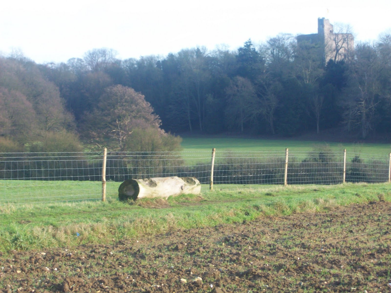


I chose to film at these locations for shots 9-10 as the song in my music video is titled "the funeral of hearts" which suggests that some of the video will have to be shot in a romantic setting, I felt that this location with Hills and wooded areas would fit this criteria as areas of countryside like this our commonly thought of as being areas of romantic scenery. Having the castle in these shots also contributes to the characteristics of a romantic setting. The castle in my music video symbolises the age of love and how it has always been there even when some of the older things are starting to decay love is still around us and always has been.
Storyboard for music promo video (shots 1 - 5)


These are the locations I will be using for shots 1-5. I chose these locations as the area is wooded with a field next to them which will be perfect for extreme long shots and long shots as the field stretches a great distance from wooded area. These are ideal locations as I will be able to shoot from the field into the wood which is what my illustrations on my storyboard repesent. The wooded area is also a good location for the shots with the gravesight as it is a secluded area with little natural light which will be good in portraying the intended representation of my music video.
Thursday, 6 January 2011
Ancillery Task 2 (magazine advertisment for dvd 2)

On this version I chose to follow the signature of album adverts by incorporating the image of the dvd cover into the advert. When designing a second version of the advert I chose to include tour dates and a special offer. I chose to include tour dates as rock/metal music is ultimately about live performences and fans going to see the band live so I thought it would fit the codes and conventions of rock/metal music by including the tour dates. Including tour dates will also make more money for the band as people are more likely to buy gig tickets if they know where the band are performing and when they are performing. Also on this design I chose to include a special offer in order to grab peoples attention. The offer on this design says that if someone buys the DVD directly off metalhammer.co.uk they will receive a free T-shirt before they are officially released. This will make people want to buy the DVD as Metalhammer is a well known rock/metal magazine with a widely used website which will ensure that I am advertising to the right audience. Receiving a free T-shirt that has not even been released yet will also make people want to buy as it will be seen as a very limited time offer.
Wednesday, 8 December 2010
Ancillery Task 2 (magazine advertisment for DVD 1)

this is a top quality DVD and people will want to buy it. The second review is from the well known metal magazine called Metal Hammer, a review from this magazine will achieve great publicity for the DVD as most rock/metal fans will read Metal Hammer. The review states "The Finnish invasion starts again" this shows that the band are from the scandanavian country Finland, this will help the DVD sell as Metal bands from Finland are hugely popular in the Metal scene. The last review is from the magazine Rocksound and it says "A debut masterpiece". A review in Rocksound will make more people know about the DVD as Rocksound is more of a mainstream rock/metal magazine which means more people will read it then the amount that read rock/metal magazines that are more underground. So having a review from, and in Rocksound will advertise it to more people and therefore increase the number of potential buyers.
Tuesday, 23 November 2010
Ancillery Task 1 (DVD cover design 2)

Wednesday, 3 November 2010
Ancillery Task 1 (DVD cover design 1)

Having researched rock/metal album covers I came to the conclusions that rock/metal album covers used dark colours, and had mysterious designs so I thought I would include these features on the dvd cover. Taking this into account I decided to use an ancient Egyptian theme as ancient Egypt was a mysterious period of time which not much is known about, this fits in with the codes and conventions of a rock/metal album cover as they have to be mysterious and not give away much about the content of the album. The ancient Egyptian theme was also inspired by the Iron Maiden album Powerslave which used an ancient Egyptian theme and is an iconic metal album which will reinforce the metal imagery on my dvd cover as it has used the same theme and people will think of Iron Maiden which as well will reinforce the Metal imagery as Iron Maiden have been described as the godfathers of Metal.
I chose the band name Taistelu. Taistelu is the Finnish word for battle. I chose this for a number of reasons, Firstly rock/metal music is hugely popular in Finland so having a Finnish band name will reinforce and add a great deal to the rock/metal imagery on this dvd cover.
I chose the images of pyramids to represent the song title. The pyramids repesent the song title as they are where people are buried when they die and the song title is also a reference to mummification as the heart is one of the organs that was removed. I chose the image of the broken ankh as after reaserching ancient Egyptian symbolism I found out that the ankh sybolises life so I decided to break the ankh to symbolise death which reflects the title The Funeral Of Hearts as a funeral is an event that takes place after someone dies.
I have decided to use this design as the DVD cover as it uses better symbolism then design 2 and it is appealing to the eye and arouses curiosity about the content of the album which are key features to bare in mind when designing an album cover.
Initial plan 3 (music video plan)
Tuesday, 28 September 2010
Album advert research 2

This is an advert for the Airbourne album No Guts. No Glory. Like the Queens Of The Stone Age it has the album release date but in difference to the QOTSA it includes different formats the album is availible on in addition to regular CD like digital download and special edition download. Another difference mentions a special offer, this is written on the first line of small text under the availible formats of the album. It says if you pre-order the special edition from Play.com you will get an exclusive free fridge magnet which will encourage people to pre-order and will also help promote play.com. Another difference between this advert and the QOTSA advert is that this advert includes the tour dates of the band which will make people want to see the band live and therefore will make the band earn more money then they would if they were advertising the album alone. This advert also includes the record label in the bottom right corner. This record label is ROADRUNNER Records which is a well known rock/metal record label which will also help readers to deduce the genre of music this band and album represent if all the other clues fail.
- The two members of the band either side of the member holding the guitar in the air are standing in a Che Guevara style pose which backs up the representation of rock/metal music being a form of rebellion as Che Guevara was part of a rebellion in Cuba.
- Also in the centre of the far right hand side of the advert you can see striking workers which also reinforce the view that rock/metal is a form of rebellion. It also represents standing up for what you beleive in which creates the suggestion that you should stand up for rock/metal music if it is criticized.
- On the bottom of the far left hand side of this advert you can see a truck driving through a barrier that is down which represents that rock/metal music breaks the barriers of music.

Album advert research 1

This is the advert for a queens of the stone age album. They have taken the graphic of the album cover and incorporated it into the print advert. In the Speech bubble it includes a review from the magazine Kerrang which is a well known rock/metal music magazine which gives an idea of the genre of music this band are and the tracks featured on this album. At the bottom of this advert it features the album release date and gives preview track names.
This print advert goes against the codes and conventions maybe even a stereotype of rock/metal music style as on the advert it uses bright colours like pink and yellow but in turn it backs them up by using the colour black in places.
Rock/Metal album cover research
 Him - Love Metal


Initial Plan part 2 (the type of music video)
Having researched rock/metal music videos I intend to make mine a narrative music video. I intend to do this as my research has led me to discovering that there are very few/no rock/metal music videos of this kind so it will be good to produce a rock/metal music video in a different way that will broaden the horizons of rock/metal fans. As it is a narrative music video it will not feature a band playing. To compensate for this I intend to make an interview with one of the band members, that will come in aproximately 2 minutes into the music video, the music video will cut or fade out to the interview.